How to Make Your Careers Website Usable for People with Disabilities
Scroll through your careers page and fill out your job application using some of the assistive technology below. Can you do it?
Technical Standards
Developing Accessible Jobs Websites
Part 3 of a four-part series.
Regardless of whether the Americans with Disabilities Act (ADA) or state law requires careers portals to be accessible, many employers want their careers websites to be so that they can recruit people with disabilities—a talent pool that could help employers fill jobs more quickly in the tight labor market. To achieve this goal, these businesses should not only strive to meet technical standards but make quick fixes and implement website-accessibility policies.
The World Wide Web Consortium's Web Content Accessibility Guidelines 2.1, published June 5, includes guidelines for making websites more inclusive, noted Corinne Weible, deputy project director of the Partnership on Employment & Accessible Technology (PEAT). While WCAG 2.1, levels A, AA and AAA (lowest, average and highest compliance), does not supersede WCAG 2.0, the consortium recommends that website designers use WCAG 2.1, even though there are "just a few minor tweaks different from WCAG 2.0," said Jonathan Lazar, a professor at Towson University in Maryland.
Nevertheless, "as WCAG 2.1 becomes more well-known, it is possible that it will replace WCAG 2.0 as the default standard," predicted Kate Gold, an attorney with Drinker Biddle & Reath in Los Angeles.
10 Tips for an Accessible Website
Weible shared PEAT's top 10 tips for making websites accessible:
- Screen reader compatibility. A screen reader is assistive technology that people with vision impairments can use to translate a website's information into speech or Braille. For the screen reader to work, there must be detailed and consistent navigational elements in the page structure, such as headers, titles and lists. Most operating systems today include built-in screen readers, including Narrator on Windows and VoiceOver on Mac OS X, that employers can use to test their websites. To open Narrator in Windows, click the Start button and then, in the search box, type "narrator." To turn on VoiceOver on a Mac, press the Command key plus F5. To turn it off, press F5 again.
- Alternative text for images. People who can't see images rely on well-written descriptive text, visible to screen readers, to understand the information images convey.
- Color contrast. Red-green colorblindness affects up to 8 percent of men. Ensure that they can use your website by testing your design elements for proper color contrast. Tools that can help include Chromatic Vision Simulator, which shows what your site would look like to people with different types of colorblindness, and VisionSim, which simulates several visual impairments.
- Keyboard accessibility. One of the easiest initial tests for accessibility is whether an individual with a disability who is using a screen reader or other adaptive technology can use a website and fill in its forms without a mouse. Can the person tab through the website content from beginning to end, or does he or she need to use a mouse?
- Controls for moving content. Some websites use moving content to engage users, such as animations, slideshows, videos and pop-ups. Best practices for accessibility include avoiding excessive blinking, which can induce seizures, and including a stop/pause button for users with visual-processing or cognitive disabilities.
- Captions. Ensure videos have captions for users who are hearing impaired.
- Controls for timed content. Many people using assistive technology require extra time to navigate a website and complete tasks. The user should have options to turn off or extend time-limited pages.
- Labeled forms. Be sure to explicitly label form fields such as boxes to check, data fields and radio or option buttons so that people using certain types of assistive technology, such as screen readers, can understand them. Labels should tell the user that they have encountered a field, explain what type of field it is, and in some cases provide additional cues to let the user know what type of information is needed.
- Accessible downloadable files. Any downloads on the website need to be accessible. Many savvy companies avoid this issue by adding all content directly to their website in HTML, which also simplifies navigation for mobile users. But if an employer has to include downloadable files, the files should be checked for accessibility before posting.
- Plain language. Simple, concise language will help all users navigate websites, including individuals with intellectual and learning disabilities, cognitive issues, traumatic brain injuries and other disabilities.
In addition, any captcha tests—used to determine whether the webpage user is human or a bot—should have an audio option.
Solution: Pair Meaningful Colors with Descriptive Text
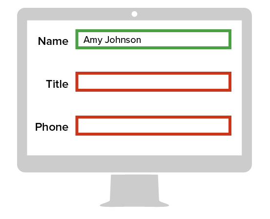
Color Alone as an Indicator

Using color alone to indicate important content makes it difficult or impossible for individuals with vision impairments to understand what you are trying to communicate.
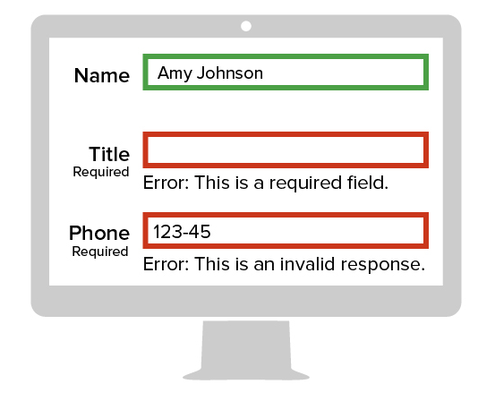
Color and Text as Dual Indicators

Combining color with text is recommended so that all users can understand the message that you are trying to convey. Identifying required fields with the full word "Required" is recommended over using asterisks.
Weible noted that haptics, the science of touch, offers many exciting possibilities for increasing access. Researchers have developed sensory touch screens that provide tactile feedback, allowing the user to feel bumps and variations across a screen. This capability, though just being developed, offers such possibilities as Braille lettering to making a map discernible.
[SHRM members-only toolkit: Accommodating Employees' Disabilities]
Website/ICT Policies
Companies should adopt accessibility policies and share them internally and externally, recommended Carol Glazer, president of the National Organization on Disability in New York City.
PEAT notes that under settlement agreements reached with the Department of Justice under Title III of the ADA, the department has specified methods to implement website accessibility.
These methods include:
- Adopting and distributing a website/information and communication technologies (ICT) policy.
- Conducting a written evaluation by an independent website-accessibility consultant on conformance with WCAG.
- Providing a notice about the accessibility policy that is prominently and directly linked from the website home page. The notice should include a toll-free telephone number and e-mail address so that people with disabilities who are experiencing technical difficulties can request assistance. Those staffing the phone line and receiving the e-mails should be knowledgeable about the policy.
- Training employees and contractors who have responsibilities related to the website/ICT policy. That includes those who design, develop, procure and maintain the ICT.
- Designating an employee who reports directly to a high-ranking official as the website accessibility coordinator.
People with different disabilities also might test websites to identify any barriers not otherwise apparent. Test websites with a variety of screen readers to ensure accessibility, Weible said.
Prioritization
Glazer recommended that employers set a plan to achieve accessibility and define clear and measurable milestones, including dates by which each will be met.
"In some cases, a phased approach might be appropriate. First, quickly fix significant accessibility barriers. Then implement fixes for other issues," she said.
She suggested that employers perform a third-party audit before launching. Glazer observed that ensuring web access from the outset can be much more cost-efficient than seeking to retrofit an inaccessible site. She emphasized that companies with accessible hiring websites "can gain a competitive edge in courting talent with disabilities and improving the overall employee experience."
Weible said making websites accessible "is an ongoing process, not a destination."


